MMR Insights: Product Evolution
I’ve been publishing morning routines weekly at My Morning Routine for over three years now. In retrospect it has been quite a journey, and with this article I’m going to start a series of sharing insights about how My Morning Routine (MMR) has evolved over the years.
Let’s get you up to speed!
How we came up with the idea
The idea for My Morning Routine evolved over time. It’s hard to pin it to one specific event, but Tim Ferriss’ book The 4-Hour Workweek and Joel Gascoigne’s blog certainly pushed the right buttons in my brain to build and launch it in December 2012, with my co-founder Benjamin Spall.
Up to that point I’d been kinda obsessed with optimizing workflows, not just with the goal of increasing my productivity, but also with a view to providing increased freedom and happiness. MMR represents that, bringing our audience a continuous stream of ideas to mix into their morning.
Launch and relaunch
Our first goal was to quickly validate if there was a market for MMR, because, well, it’s a niche after all. We wanted to avoid wasting time, so we launched the MVP in less than a month.
During that month (we both had full-time jobs) I thought about a content focused design, sketched variations, and presented them to Benjamin, most of the time without any opinion at first, because I wanted unbiased feedback. A couple iterations later we nailed down a design, which I then transferred in a higher fidelity to Photoshop (no Sketch.app yet) and again iterated on it until it seemed well suited for a first version. Afterwards I developed the design as a responsive Wordpress theme.
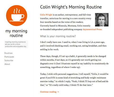
For the first two years of the site’s existence we used this simple theme and a shared hosting infrastructure, and we almost entirely published routines from people who would fill in a small contact form on our website saying they would like to participate. This method worked well in the beginning as it allowed us to build up a vast archive of morning routines while being able to treat the site as a small side project.
Since then, for the past twenty months or so, we’ve for the most part been approaching individuals we want to interview on the site to see if they’d like to be involved.
In mid-2014 we started working on a second version (v2) as we were gaining much more attention and wanted to improve the overall experience of our site. The new MMR laid the foundation for many new features to come. Our main design goal was to bring a greater sense of personality to the site while vastly improving the user experience when browsing between our routines on all kind of devices.
Besides the obvious improvements, v2 came with a whole new world under the hood. The new MMR runs database-less from servers all over the world—meaning the site is always fast (and always up) whether there are 1,000 or 10,000 people reading a particular routine at once. This was important to me, because regular press mentions slowed down or even downed our Wordpress site. In addition I wasn’t happy about the constraints and unnecessary footprint that comes with running a very feature specific site with Wordpress. I value highly efficient code, with the smallest footprint possible. That’s why from v2 onwards our stack transformed from Wordpress to Jekyll, AWS, Gulp.js to build, and s3_website to deploy.
As with v1, I started out with pen and paper and held regular feedback calls with Benjamin and designers in my close network. Below is an example Sketch artboard of v2, which also includes different mobile navigation concepts.
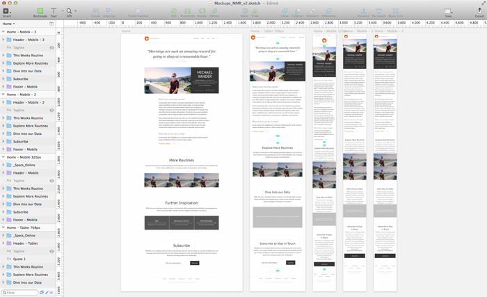
We launched v2 with the routine of popular author Mars Dorian, combined with a giveaway, and a post on Product Hunt, which ended up in third place with over 200 votes. At the time, this was still a lot. Leaving us with confidence that we’ve stumbled up on something, and at the right time.
Small improvements and new features
After the relaunch the real fun began. The new foundation enabled me to implement new features much easier, but first we decided to give our newsletter design an overhaul and to A/B test different variations. To our surprise a simple, personal looking design worked best with our audience.
Spurred on by these results, we started to use Optimizely to test different hypotheses on our website, and we also started to use UserTesting to gain direct insights about what was working and what needed to be improved. We were also continuously looking at our copy, which I’m really proud of. Benjamin is a great copywriter and I’m more than happy to be able to work with him. Another example of our attention to detail is our text variations depending on the available screen real-estate; and of course we remove some elements on small screen sizes (try it out).
Since the end of 2014 we started to describe My Morning Routine as more of an online magazine than a blog, as we added (and have continued to add) several more functionalities to the site.
Questions & Answers
It’s hard to ask the same questions time and again without noticing certain trends coming out of the answers, this is why we built Questions & Answers, another way to gain new ideas to mix into your morning routine.
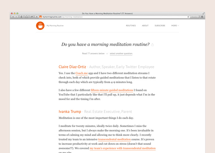
Interview Statistics
With Interview Statistics we make it easy for you to dive into our data to explore key findings from our ever-increasing archive of inspiring morning routines.
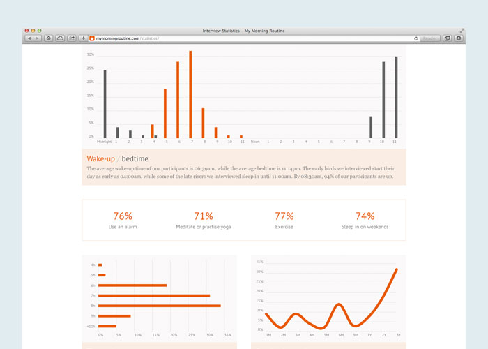
Further Inspiration
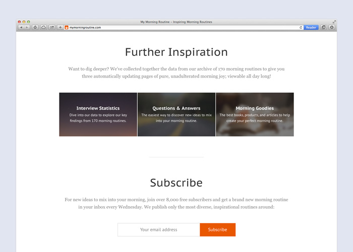
We added a ‘Further Inspiration’ section on our home page, and below routines, to promote our new pages, which increased their pageviews by about three times.
Routine Sorting
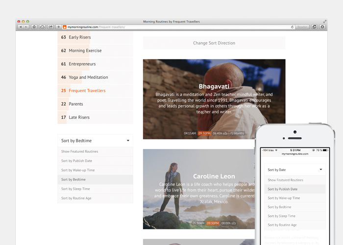
Our new Routines page features informative data labels on every routine card, as well as the ability to sort routines based on these data points. Psst, we actually track the sorting options for popularity, which helps us to prioritize upcoming features.
What’s next for MMR
Our main focus is and will always be to get inspiring ideas in front of our readers. We’ll continue to add, iterate, and remove features to provide the best possible user experience.