My Morning Routine (v3)
My Morning Routine is an independent online magazine that publishes a brand new, inspiring morning routine every Wednesday. I started the project in December 2012 with my co-founder Benjamin Spall, who is our editor-in-chief. I lead design and development. We split the duties of marketing, finance, and everything else that comes up. In early 2016, Michele Boltz joined as an editor. In August 2016, we launched v3, which we have been iterating on ever since.
Project scope
The design goal of v3 was to bring a greater sense of an online magazine to the site, while keeping its familiar look and feel. Our business goals were to refactor our codebase to a component-based architecture in order to build and ship new features in shorter (1-2 week) sprints, and to make sponsorship placements more flexible and efficient.
My Morning Routine has evolved into a diverse project with interviews and readers from all industries, of all ages, and from all walks of life. For us this meant providing a great user experience for a wide array of personas. In the past, for example, some of our interviewees didn’t have high-quality photos of themselves available to go alongside their interview, so we decided on a constraint of a maximum image size for all participant photos. Going forward, we’re looking at the potential of sending a photographer to take photos of our guests specifically for their interview with us. During this period we also recognized a trend toward mobile traffic, so we defined another goal to support and provide a great touch experience for screens down to a 320 pixels horizontal resolution.
Research
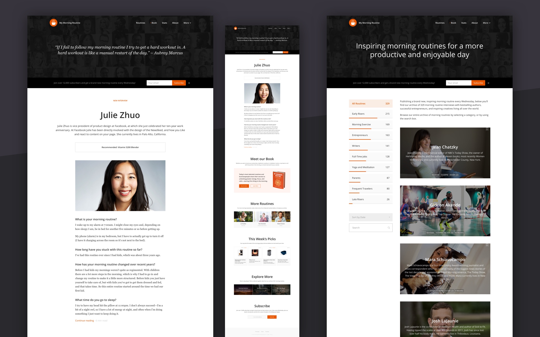
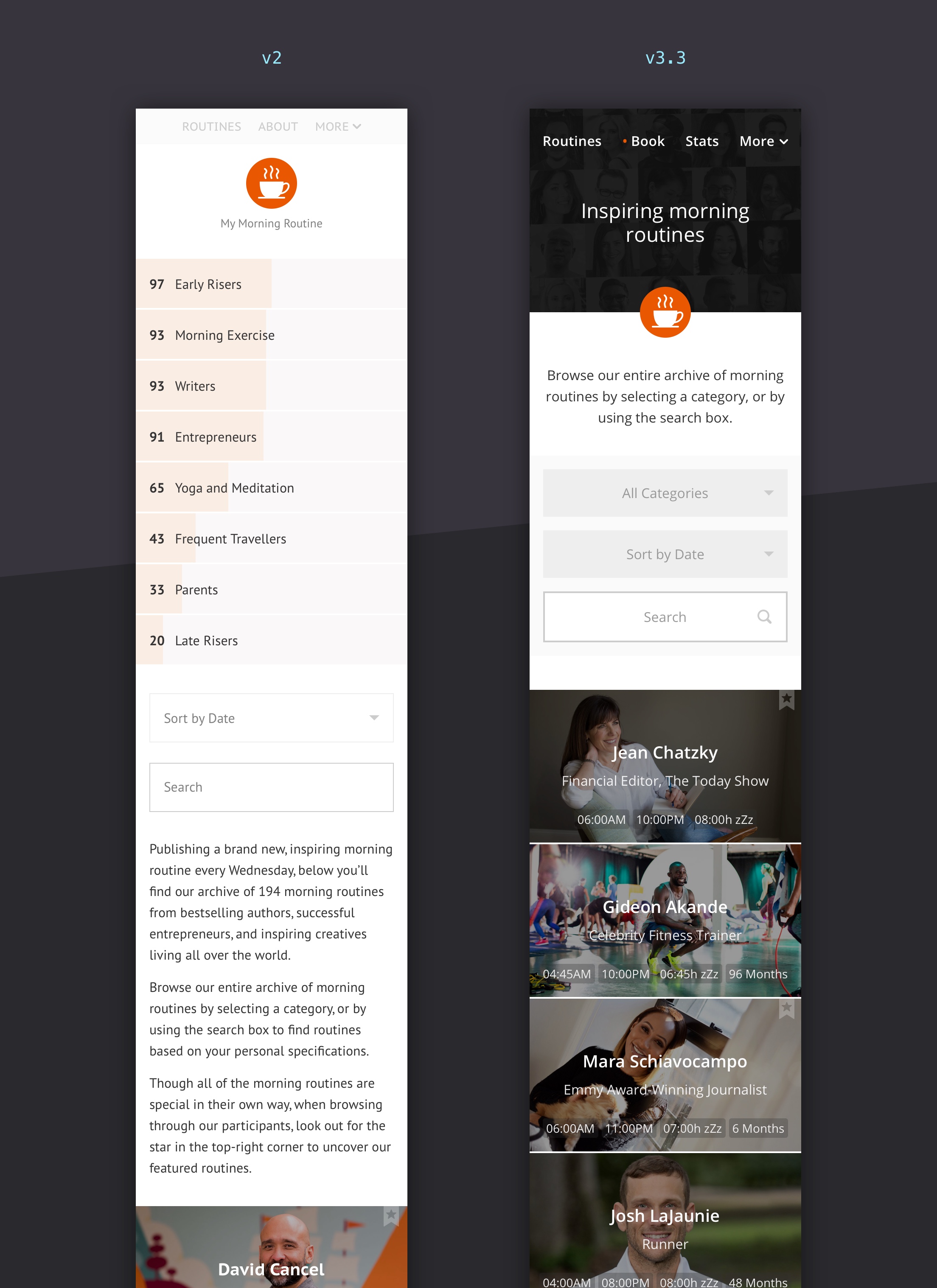
After launching v2 in mid-2014, I made a habit of collecting feedback from email subscribers and across our social channels. We also started to use Optimizely and UserTesting to gather insights on what was working and what could be improved. One recurring theme was that it sometimes took new visitors a moment to understand that we aren’t a personal blog. This would happen as the latest person we had interviewed was displayed front and center on our home page.
Concept
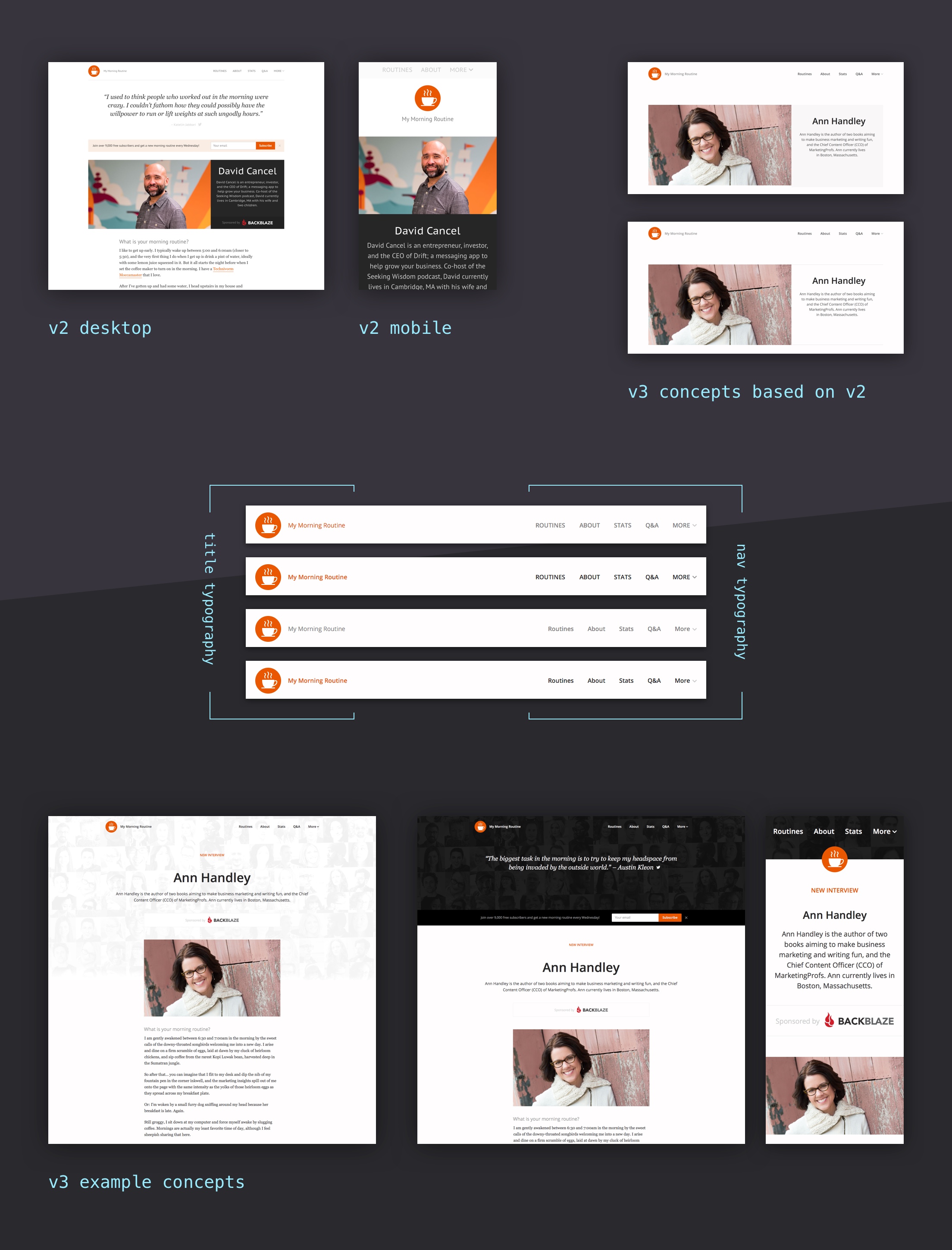
I first scribbled down and explored different versions of the components that we wanted to improve, looking into how these could work on our supported screen sizes, and in edge cases (dirty data, states, etc.). I then gathered feedback from Benjamin and iterated on what worked.
For the refactoring of our codebase, I was inspired by component-based architectures, design systems, and build toolings like Pattern Lab, Scooter by Dropbox, Primer CSS by GitHub, and Tachyons. The result was my own take on build tooling for web development—gulp-jekyll—combined with following the BEM methodology and my code-guide for our new front-end architecture.
Prototype and polishing the design
In Sketch, I first tested how the new concepts of the components would actually work in a higher fidelity, which allowed us to pick what to focus on. For example, I made multiple versions of a new header, with all kinds of sizes, colors, and shapes, that featured photos of many of our previous interviewees to support our design goal and to make people realize that we weren’t operating a personal blog, but rather an online magazine featuring a wide variety of people. I also explored how we could tweak our navigation. While uppercase typography has become a trend for many different types of design elements, in my opinion capitalized typography offers better readability in user interfaces (UI), which is why we moved almost entirely away from uppercase typography in v3.
We moved forward with the bottom right version because of its flow of content, contrast, and hierarchy. It allowed us to change shapes (e.g. our book landing page), add content elements (e.g. our “call-to-action” bar and the “New Interview” label—another countermeasure to the problem of being identified as a personal blog), and we also included rotating quotes on the home page to again support the magazine vs. personal blog aspect. For articles and pages I developed a configurable secondary header that is smaller and pushes the title of the article into the <article> tag for semantic markup.
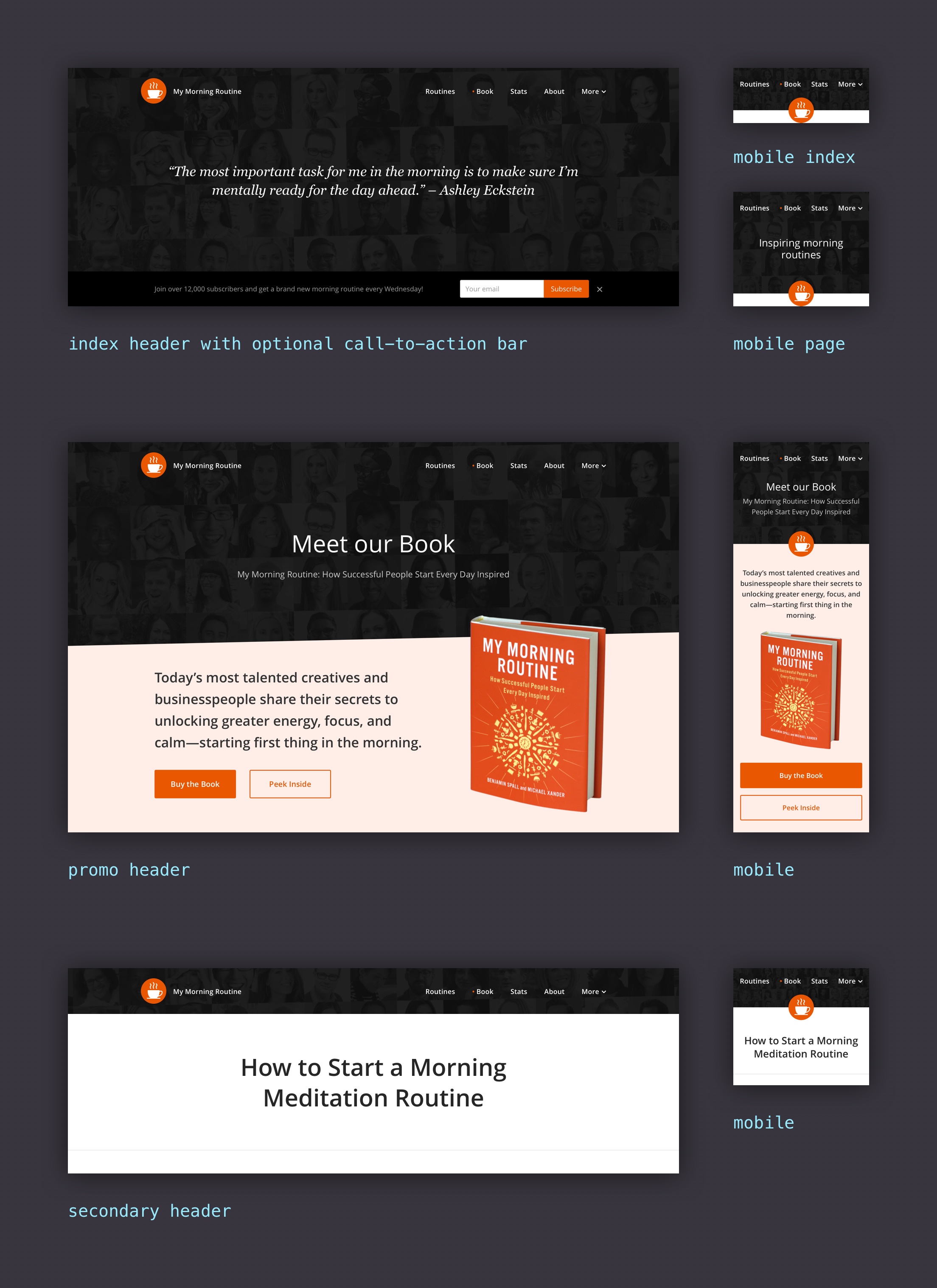
During this period the website typography received an overhaul, and I added more whitespace to utilize the trend toward larger screens and resolutions. Headlines and section descriptions received more contrast for better discoverability and readability. We also added more cross-promotional sections. We changed our UI copy so it is responsive (text gets cut without having duplicate markup in the source files), where it makes sense, to provide the best experience on all screen sizes. Additionally, I implemented configurable headline widths to give our editors control over awkward line-breaks. We also worked extensively on tweaking the website’s copy during this time.
Our archive of routines is the gateway to exploring the rest of our site. Many detailed improvements made it into v3 while still keeping the site’s familiar look. For example on mobile, the navigation and content comes much earlier because of the redefined mobile navigation and responsive copy, and touch areas and fonts have a sensible default size, so to ensure they’re readable and clickable on mobile devices.
Once all required screens were designed, discussed, and iterated on, I started to develop our new front-end architecture (I open-sourced the underlying build tooling and core structure; though MMR has additional modules that aren’t in gulp-jekyll). We achieved a Google Lighthouse performance score of 99/100. Here are a few technical details:
- Builds have live linting (CSS, JS) to ensure our code-guide is followed.
- CSS preprocessor features through PostCSS Advanced Variables, PostCSS Nested, and PostCSS Preset Env.
- Unused CSS is removed from the production files through UnCSS, and cssnano optimizes the remaining CSS.
- JS is bundled, and UglifyJS optimizes JS.
- CSS, JS, JSON, XML, and HTML files all get minified.
- Media assets are compressed, and responsive image sizes are auto generated.
- Media containers are lazy-loaded and don’t jump.
- Automatic build tests for data integrity and functionality.
- W3C valid semantic markup.
- The website is SEO optimized (I previously worked as a PM at a leading SEO software company).
- The BEM methodology is followed to keep the CSS easy to maintain and scalable (no more specificity problems).
- The website is deployed to AWS with a caching strategy optimized for performance (incl. revisioning of assets).
- Social and Instagram images are automatically generated through puppeteer.
One benefit of being a designer and developer is that you can improve and validate your designs quickly. The awareness of the engineering side is immensely valuable, as it allows me to produce work that is technically feasible and thought-through from multiple perspectives.
While I always explore new designs without limiting it to technical aspects (unless specified), I follow systematic rules driven by my developer hat, such as, for example, The 8-Point Grid (using multiples of 8 to define dimensions) to ensure design consistency. I believe it is this developer-thinking that has brought us the design system revolution.
Iterations
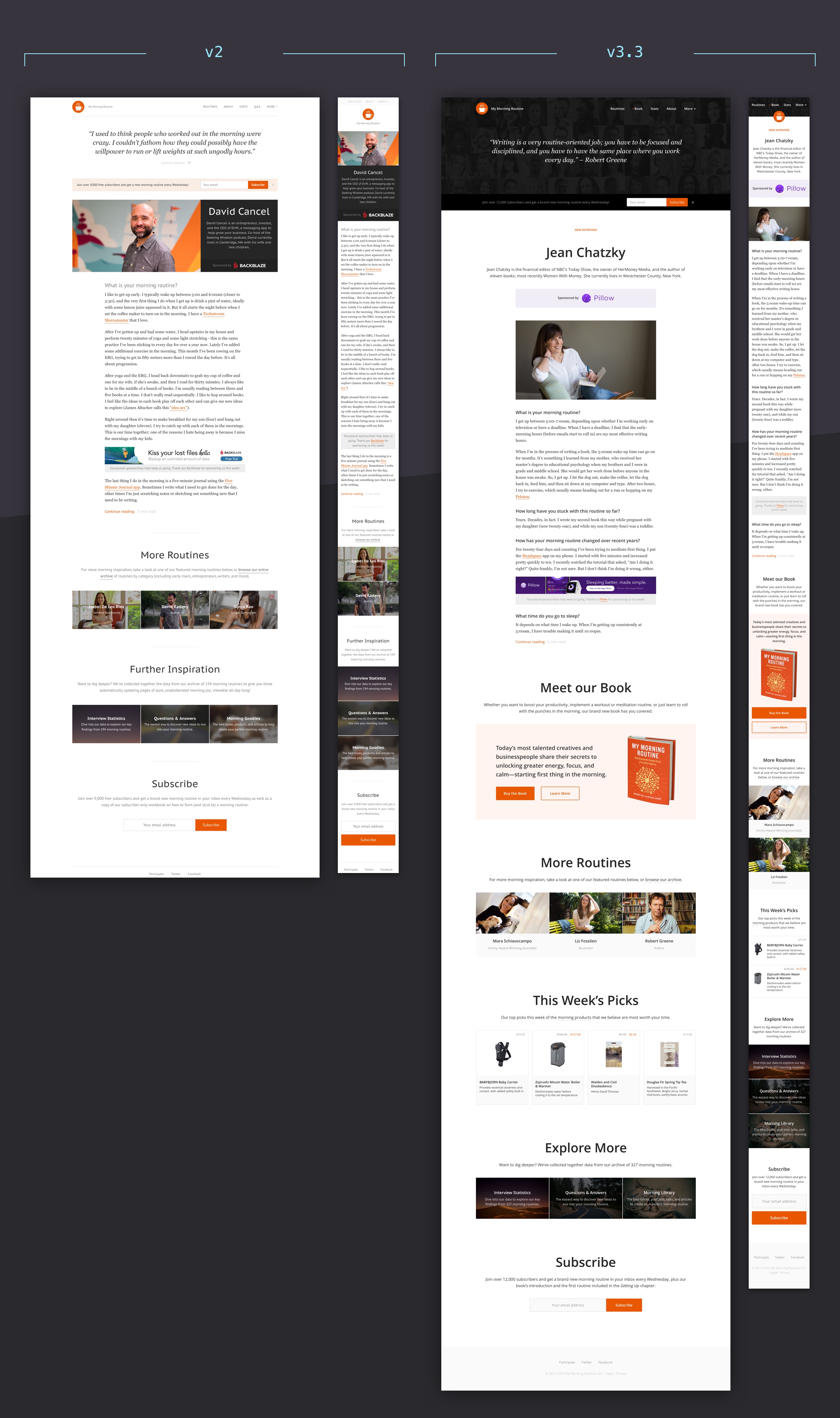
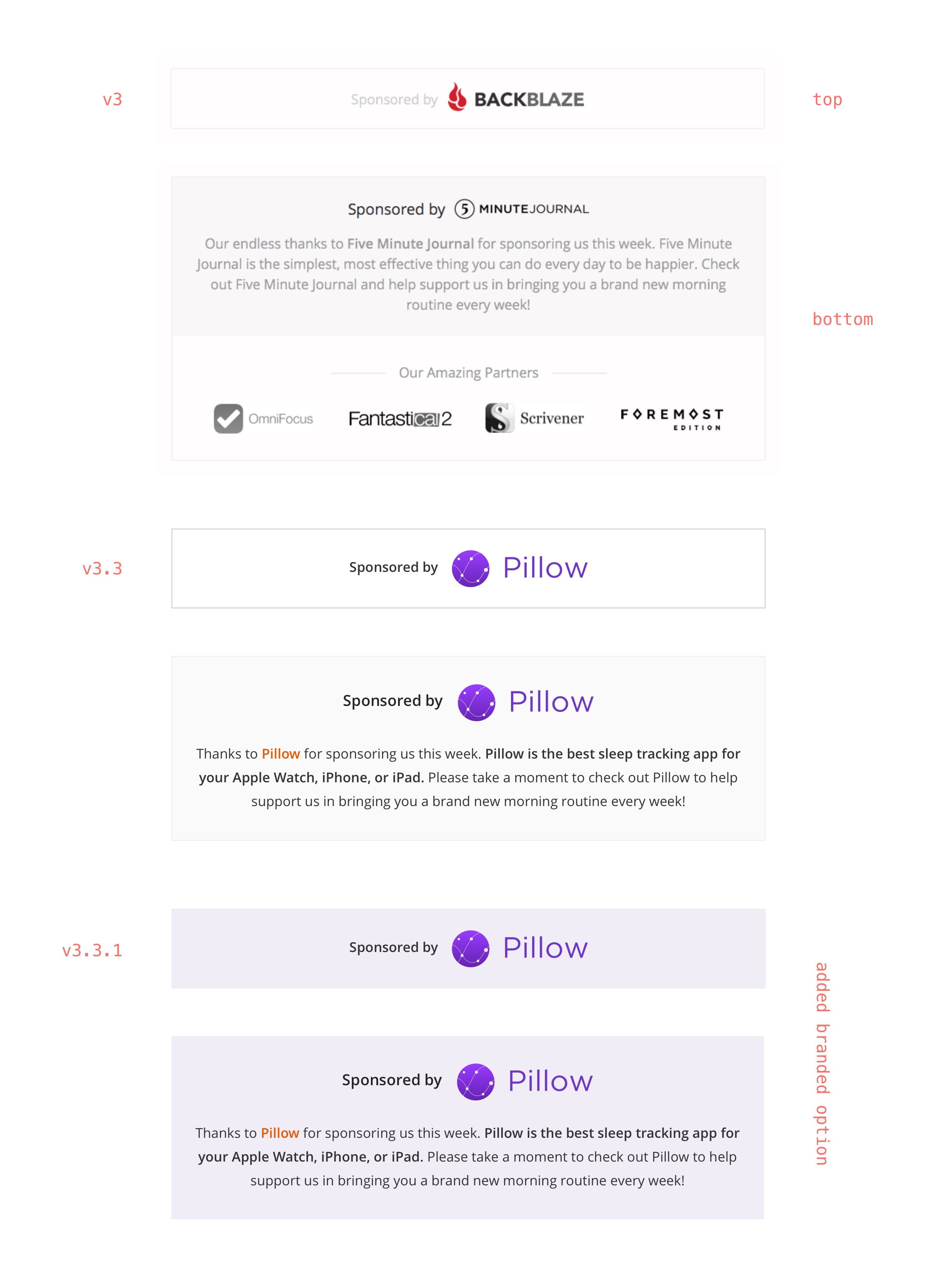
You may have noticed that many of the above screenshots included a v3.X version. Building great products is a process that never ends. Driven on real data and user feedback, we made further changes to accomplish our goals. Sometimes these changes were as small as adding more contrast to an element, such as our brandable sponsorship placements to increase CTR without sacrificing user experience.
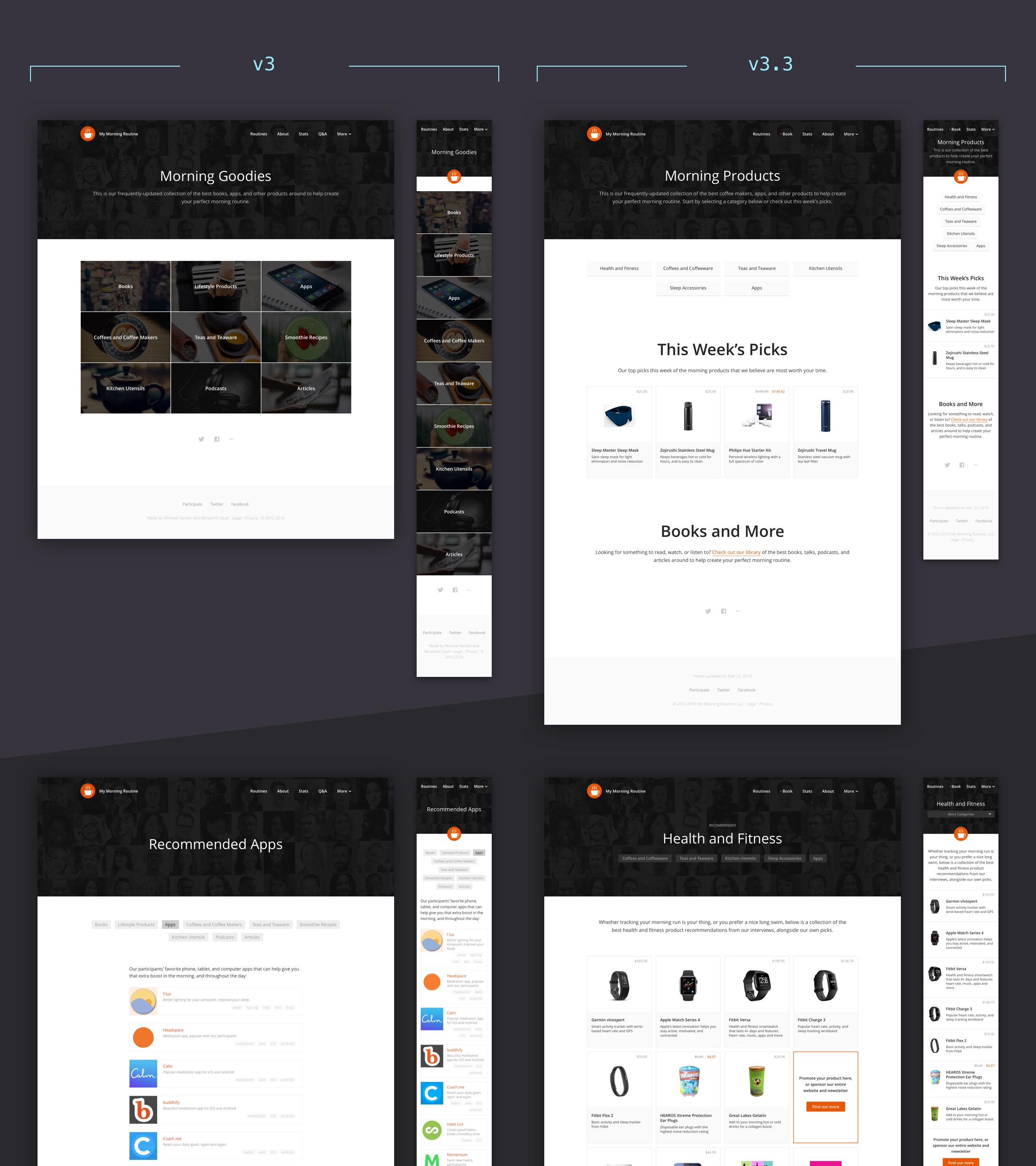
Other times it required an entirely new concept to achieve our goal. One example is our Goodies page that we rebranded into Products and Library. We made it easier to browse these pages on all screen sizes, and we made it visually more appealing to support our goal as an online magazine. Later, we added product prices and a deals page to give our audience comprehensive recommendations.
It brings me a lot of joy to iterate and test small details. If you’re intrigued by My Morning Routine, be sure to check it out on all of your screens. It’s my playground, so needless to say, it will certainly evolve further!